I have enjoyed sharing about my illustration career. On this blog there are over 2,200 images. I find the blog format fascinating, as my stories about my illustration career “unfolded” in their own way. I had no idea when I started writing my blog where it would go.
All of my stories, tips and information move forward from the first post. For this post, it is important for me to explain a few things that I have shared earlier on my blog. There are people reading this who might not have not seen anything else I’ve written.
I’ve already shared many of my portfolio pieces, but they have been scattered all over. It seemed like a good idea to group them all together for this medley of portfolio illustrations. For those who are not familiar with my painting techniques, most of my illustrations are completed with Dr. PH Martin dyes. I also use Prismacolor pencils and Badger Air Opaque acrylics for details. Some of my illustrations are done using only Admarkers (with additions of colored pencil and acrylic, such as the Banana Split below.)
From the time I graduated college until the present time, I considered myself an illustrator. My career suited me perfectly, because I was able to balance many things in addition to being an artist.
At times, being an illustrator was very stressful. There was a lot of “performance anxiety,” that went along with ridiculous deadlines and the pressure to please many people involved in projects. I often worked with people who all disagreed with one another and gave me conflicting art direction! However, I was always reliable and tried hard to do my best. I improved over the many decades as an illustrator.
I reached a pinnacle and felt very competent illustrating food, florals, and any still life object I could find reference for.
But then there was a time when most of my commissioned work stopped. It turned out it wasn’t a bad thing. During that lull of not receiving assignments, I discovered how much I loved sharing what I’ve learned with other people.
It gave me a lot of purpose and meaning to write about those lessons in my life. On this blog, I write about those lessons from being an illustrator, and on my other blog www.myjourneysinsight.com, I write about other life lessons I have faced.
I was very blessed to have had such a wonderful career as an illustrator!
When people see any of the illustrations in my portfolio I am often asked this question: “These paintings look like photographs? Why not just take a picture instead?”
Here is my answer:
1. Using an illustrator was often cheaper than photography. (No stylist, retouching, photo-shoots required). Sometimes the products did not even exist to photograph.
2. It was much easier to fit an illustration into the design of a packaging label.
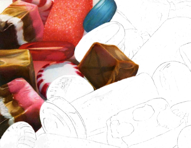
3. And this was my favorite answer: I liked to think that my paintings were more than just a photograph. They were idealistic, because I attempted to make my images look exciting – shinier, more brilliant and more perfect. I tried to achieve this through the use of color, contrast and simple composition.
When I graduated college, I had no idea that I would specialize and become a “food illustrator.” However, I did have two pieces in my portfolio that steered me in that direction. One I called, “Vegetable Medley.” For some reason, I liked using the word “medley” to name many of my portfolio pieces. The other was a black and white painting of liquid pouring into a glass.
 My portfolio was initially about sharing my best paintings. That never changed throughout my career; it was always more important than proving I had published work.
Therefore, my definition of a “Portfolio Piece” was a painting that would showcase and sell my abilities as an illustrator. It needed to be something that depicted my “strengths” and displayed what I could do best.
I kept my portfolio simple and didn’t show anything that might be detrimental – even though art directors were notorious in wanting to see examples of something close to a job they were looking for. Most illustrators know that clients often lack imagination about making a leap in subject matter.
Statements like these made me laugh and I heard them so often!
“I see you have a chocolate bar, but do you have any examples of melted chocolate?”
“I see you have tortilla chips, but can you do potato chips?”
“You’ve done cold cereal, but can you do hot cereal?”
Artist representatives told me only to share portfolio pieces of the work I wanted to do. That was perplexing at times because I had some nice paintings of beverages, but didn’t really want to illustrate them under a lot of time pressure (they are VERY complex). I demonstrated that I could do lettering on products, but always hated that part of illustrating.
When I began my career, I used to take my portfolio to appointments with local art directors. I painted two of what would probably be the most important paintings to guide my style of illustrating. It was my Nestle Crunch bar and Coca Cola glass. Those paintings opened up a lot of doors for me.
I had done the lettering by hand on both of them, and in the advertising domain it was not considered “perfect” enough. I had to find a way to create perfect lettering.
Eventually, I did.
After that, I indulged myself to create paintings that truly allowed me to explore what I loved through textures, colors, and contrast. I used my own photography as my reference and painted a “Portfolio Piece” every year or two. My purpose for these paintings would be to use them for self-promotion.
Because I was usually busy with assignments coming in, I wasn’t always that motivated to paint something for which I wouldn’t be paid. However, it was important for me to advertise almost every year in a “Source Book” for art directors to see my work.
Below are some examples of my ads that were very useful for gaining credibility with art directors and for getting jobs:
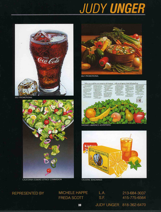
This was my very first ad in “The Workbook.” It was very expensive for me at that time – about $3,500.
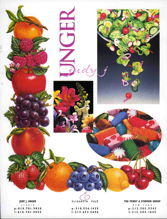
I received a lot of compliments for this ad design. I t made a huge difference when I hired a graphic designer to put my ad together for me.
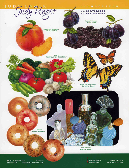
This was my last printed ad in The Workbook. I designed it myself and incorporated the nice lettering from a designer’s prior ad.
Painting portfolio pieces helped create colorful advertisements that showcased my style. Printed job examples were also important, but they were never as impressive as something that I created to please myself.
I still have boxes of the expensive ads that I had printed. There is no need for me to do time consuming “envelope stuffing” anymore. The Internet is a far easier way for an art director to find me, and most of the places I used to mail my samples to have gone out of business.
I did design my own ads for many years, but with success I decided that even the ad design needed to be more professional. Because I was never very comfortable with graphic design, I hired a designer for the last six ads that I did. It made a huge difference. I always had admiration for designers, and even more so after that because I saw what an improvement it was over my own “boring” placement of images.
My postcard promotion with my Snickers and Nestlé’s candy bars was also very helpful for my career. It was often easier to share a postcard than a larger tearsheet.
So much of what I have shared is not relevant in today’s career marketplace. I don’t know if there will be more projects for me “down the road.” Working digitally is certainly much faster and easier on my eyes.
For me, my journey into becoming an artist started when I was very young. I do not believe that talent alone guarantees success.
My passion to do my best is what truly guided me.
I continue to do that now as I pursue writing and music.

Ice becomes very abstract when illustrated up close. Someone thought this looked like an angry face!

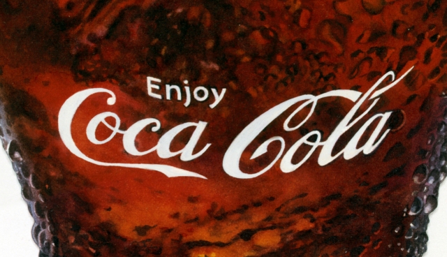
This was painted using custom rub-down letters as a mask. I provided a lab with a black a white map for the letters. I had to cut away areas where there were droplets.

My portfolio painting named “Herdez.” Later on, I digitally removed the jar so I could use the illustration as a stock image.
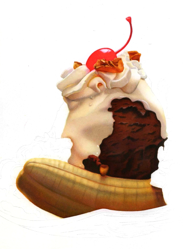
I began a painting for my Banana Split, but decided I preferred my marker version. The whipped cream is a good example of how there are many colors even in a subject that is basically white.

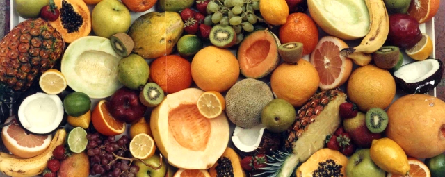
My portfolio painting named “Fruit Stripe.” It’s hard for me to appreciate how long this painting is. I usually work fairly small and this was approximately two feet wide.

This is an example of a stock image that was taken from my extremely horizontal Fruit Stripe painting.
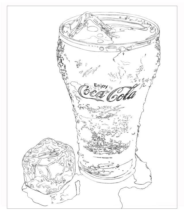
I used my photo to create a template for custom rub-down lettering. It was a white mask that I removed later on.

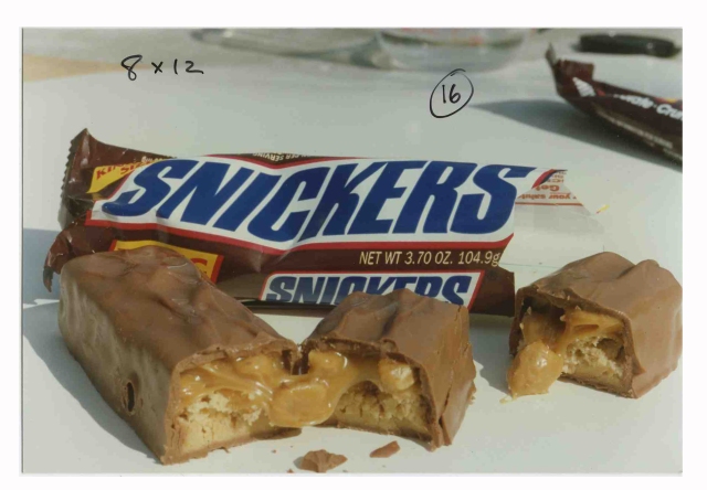
In 1992, I won the gold medal award in the “Unpublished Category” for my Snickers Bar illustration at the annual Society of Illustrators, Los Angeles “Illustration West” show.


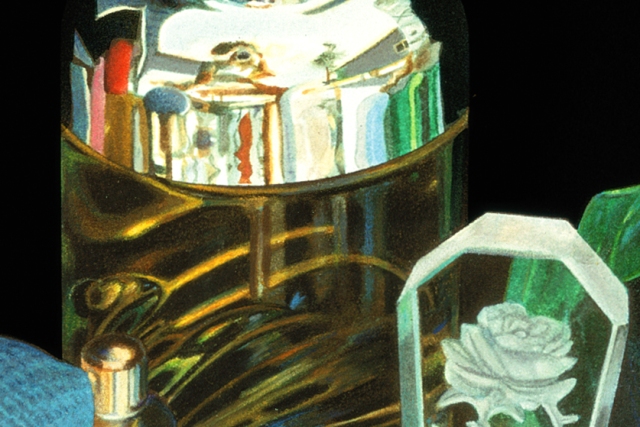








Wow, your illustrations are amazing! I had to take a closer look at some pictures to convince myself that they’re not actual photos.
LikeLiked by 1 person
Everything looks stunning. You could easily turn these illustrations into larger scale paintings. I cannot imagine how somebody drawing that well and having worked out such a perfect technique would stop applying these skills. Really enjoyed!
LikeLiked by 1 person
Thank you so much for your lovely comment, Inese. I looked at your website and you are quite talented. I can see that we enjoy some similar subject matter. What might be interesting, is to know that I haven’t stop applying my skills. I recently completed a large project (twenty fruit illustrations) for a large national brand of yogurt. I did utilize the computer and it worked well for me. I’ve had eyesight issues over the last year. The most amazing thing is that now I have passionately applied my skills to music and am enjoying the results so much. I appreciate your checking out my work.
LikeLiked by 1 person
Reblogged this on Living and Lovin.
LikeLiked by 1 person
I am so touched that you did this! Thank you, Eunice!
LikeLike
I am blown away by them 🙂 I shall add some tags and see if we can make you go VIRAL 🙂 you inspire me to just spend more time with my paints can’t wait till IO can do something worthy of SHARING 🙂
LikeLiked by 1 person
I’m still illustrating, but my true passion is music. Thank you so much for your compliments. I laugh at the craziness of my clients sometimes. All my work is pretty much on the computer now, which is easier on my eyes. You have a lot of followers – so you I think you are very inspiring. Here’s a link to a story that was for a fairly recent job. http://myjourneysinsight.com/2013/10/02/colors-and-sounds-filled-me-with-delight/
LikeLiked by 1 person
Thanks I will check it out 🙂 You know I do not know what they see in my blog lol maybe just some pretty New England photography
LikeLike
I think it’s not about seeing. It’s about feeling and you are passionate. I saw that you liked James Taylor – my major influences were him and other great guitarists from the 70’s. If you’d like a free CD of my music, let me know where to mail it! My email is judy@judyunger.com
LikeLiked by 1 person
OMG being from New England him and Carly were all over my world. I love acoustic even when it is Godsmack 🙂 I was born in 56 and grew up with the BEST MUSIC ! Spending 18 to 24 hours a day in a rig for 27 years I listened to a lot of music. I also booked a local Blues in local bands but the closest I came to music was a clarinet and signing in the choir 🙂 in school and church then 10 years of smoking and all that diesel smoke lol I am lucky I get to sing in the car 🙂
LikeLiked by 1 person
I loved Carly, too. That music was the best – how lucky we were! Of course, with trucking you had lots of time to listen. Thanks again for sharing!
LikeLike
Yes and I listen to all music but the past from my teen years has a strong hold on me 🙂
My Brother put up the fence on Martha’s Vineyard that surrounds her home. Her two kids were small but my brother said her daughter was a brat lol I said all little girls are when they are spoiled 🙂
LikeLiked by 1 person
Judy such an amazing artist you are! I wish you much success on your future plans.
HUGS
Eunice
LikeLiked by 1 person
Appreciate your great skill – There’s a place for most schools of ‘thought’ when it comes to painting – variety the spice etc… enjoyed your guitar playing – (NB: paul simon stuff hard to beat) – wish you much fruit from your fruit paintings! all the best KR 😀
LikeLiked by 2 people
Thank you so much for you kind comment, Ken! It warmed my heart that you appreciated my guitar playing. I still remember trying to figure out Paul Simon’s licks on “Feelin’ Groovy” and singing harmony with a good friend on “Sounds of Silence.”
I continue to enjoy illustrating fruit (it has been fruitful) and like you, I enjoy real movies with emotion over ones with effects!
LikeLiked by 1 person
Yes imagine that! You’d think artists would be the opposite (wanting special effects I mean) – but even we can get image overload 😀
LikeLiked by 3 people
Your art is fantastic! How talented you are, Judy! Wow!
LikeLiked by 2 people
Thank you so much, Ella. I have an illustration with a cool cat in the window – that made me think of you! (Here’s the link to a story about it: https://foodartist.wordpress.com/2010/06/28/24-another-post-about-compost/)
You compliment made my day – I appreciate it very much!
LikeLiked by 1 person
I just had to say how fortunate I feel to have stumbled upon your blog, not only is the work amazing, but the insight into what it take to be a professional illustrator has unmeasurable value to me as I am about to graduate and try to make my way in the world. Things may have changed as technology has progressed but seeing some of the communication with art directors and how your projects evolved was very informative, as was your suggestion on creating portfolio pieces that are very specific to showing your range of talent. And the reminder as to why this type of work is relevant!
LikeLiked by 1 person
Thank you so much for your lovely comment, Kylie. I really enjoyed sharing about my art career and things are still cooking for me. I don’t post much for this blog anymore but it’s so gratifying to hear that it was helpful for you. I’m excited for your future. Your willingness to learn from my blog tells me that you will apply that curiousity and eagerness into becoming a successful artist.
Stay in touch – I’d love to hear how it goes for you!
LikeLiked by 1 person
Dear Judy,
Thank you for showing us your eye-catching illustrations of perfume bottles, Swarovski crystal swan, and highly appetizing food. Well done!
All of these photos and writing about food here in your blog post are making me very hungry and teasing my appetite!
I shall have to cook up a big storm to comfort myself with plenty of cooked food and to satisfy my gustatory desires stoked by what you have presented here in your post.
In the spirit of your excellent post about miscellaneous illustrations of your “Portfolio Pieces”, I would like to offer you some tempting and mind-bogglingly presented food in one of my posts entitled “SoundEagle in Edible Art, Glorious Food and Festive Season” published at
Please enjoy and kindly let me know what you think of those dishes by leaving some comment(s) there!
Yours sincerely,
SoundEagle
LikeLike