
I have shared a lot of different categories of illustrations completed over my career. Of course, I still have a lot of paintings left. I’ve decided to categorize the ones for this particular post as illustrations where I needed to demonstrate versatility.
For certain, there is quite a span of years for the paintings I want to share. There are watercolors from early in my career all the way up to labels done twenty-five years later!
I’ll work chronologically and start with those early watercolors. My “Pink Lady” below reminds me why I didn’t illustrate people. My illustrations of people always felt “stiff,” so I preferred organic subject matter.

An early watercolor of mine. I copied a magazine photo.
Often in my career, I had to be versatile with the style of my assignment. Sometimes I had to match an illustration with a series of existing illustrations already printed on a line of packaging. However, in some cases I was instructed to match the style of a famous artist. This occurred on one of the very first jobs of my career when I had to paint fruit in a “Rousseau” style.


A close up. The pattern of washes in the leaves was fun to create. The dye colors were also quite bright.
That same year, I received another assignment where I created a surrealistic landscape reflecting Salvador Dali. I have to laugh seeing what is supposed to be a “modern” illustration about digital processing depicting an old, dial handset telephone!

Job layout for my assignment.

My marker comp.
For that particular assignment, I used markers on the comp and on the final art, as well. My motto of “whatever works,” always led me to utilize whatever technique was most efficient and suitable for a particular assignment.
 If I had to describe myself in another word besides “illustrator” it would be “renderer.” I was very good at copying and loved the challenge of replicating other techniques.
For a period of time, I created a few, marker comps for my own purposes in order to see if that style could work for supermarket illustrations. Because of the speed and volume required for those illustrations, I wanted to see how quickly I could crank out a “looser” style. “The produce” marker comp below was created in one hour. I truly forced myself to “loosen up!”


My example of a quick marker sketch. I create the steam effect by using a wispy wash of dissolved white Prismacolor pencil.
One of my more interesting, early jobs was creating “puzzle illustrations,” which were used for specific cities as a promotion. I enjoyed selecting images for the locations I illustrated. I created perhaps five, different city puzzles and I’m sharing my favorite one here. I liked using the bright, dye colors as a medley with simple washes, and there was not much room for overworking my paintings. Perhaps some day, I’ll get to actually visit the city of Raleigh and see those images I copied!
 There was a period of time in my career where I painted watercolor florals that could be used on greeting cards. It wasn’t easy for me to illustrate anything without the level of realism I preferred. However, a card publisher was interested in seeing some “looser watercolors,” so I obliged. Below is an orchid spray with a close up that was done as “practice” for me. I ended up not pursuing the greeting card venue because there was simply very little money in it.
 I did a lot of work for an east coast design firm, C&M Marketing/Damon Associates. I had numerous assignments where I had to match different styles. One of my favorites was a large grouping of fruit for a juice label.
I was instructed to use specific lighting on the fruit, as well as certain colors (notably on the leaves) to create a painting with a “Renaissance style.” The lighting was different for me and did not have any reflected light. I always illustrated the bottom of objects to be lighter, which enhanced the three dimensional effect. Instead, I created dark shadows on the edges of fruit and it was a refreshing change for me.
This assignment was completed in less than a week. I used water-based markers and brushes on marker paper, which was mounted first.


Another assignment from C&M was the creation of two illustrations for a packaging line of stewed tomatoes. In order to create the “pastel-like” texture, I put a piece of sandpaper under a thin piece of marker paper and used colored pencil over it. The rough sandpaper allowed for the colored pencils to embody the texture of pastels that I wanted.

My Mexican stewed tomatoes illustration.

My Italian stewed tomatoes illustration.

This is an example of a lot of reflected light. The garlic bulb embodies all the colors surrounding it.

My purchase order for this job.
I always experimented with many techniques in order to match the illustration style I was replicating. I’d have numerous sheets of paper with examples circled and marked with the steps I used to create a “certain appearance.”
I received another packaging assignment from C&M for a juice label. This time I needed to create an outline around the fruit. Although the design seemed simple, I drew all of the outlines freehand and there was no room to make an error – the lines had to be very smooth. Needless to say, I practiced a lot.

 Another style of illustration for C&M that I want to share, were some watercolors of “crinkle-cut carrots.” On this illustration, the texture of the watercolor paper needed to be visible and was a lovely “cream color.” I created purple watercolor shadows and everything was outlined also. One thing I always did when illustrating carrots, was to have a touch of green in the orange at the very top of every carrot!

 Just for comparison, I want to share one of my more realistic carrot illustrations here.

A more photorealistic carrot illustration.
Another illustration for C&M, was a label for canned Beets.

There were a lot more canned beets illustrated on the right side. That way, the label could wrap around a can.
 I did more replications of styles when I worked for a design firm in Chicago called HBN Design. I did a series of illustrations for a product called Everfresh. I was given an existing label as an example to follow, and had to incorporate strange, splash-like droplets into every illustration.

An example of a label done by another illustrator. I was instructed to copy this style.
I did six illustrations for the Everfresh line of juices. On this assignment, I only had color copies and not the original paintings to share.


I don’t even know why I painted the ginseng berries purple!
I can share an anecdote about the “Ginseng Label” I illustrated for Everfresh. I followed some poor reference and simply assumed the “Ginseng berries” looked great painted in a lavender-purple color. However, the artwork was sent back for a revision, because I was told the berries were actually red. I went over the purple with colored pencils and made it red as was requested. It is far easier to replace colors digitally now!
I did not make another copy of the artwork, but the printed label shows the difference!
I did two more illustrations for HBN Design that were similar with an “outline style.” I have to say that I enjoyed the simplicity of working in that style. It wasn’t that easy for me and I was pleased with some of my efforts, especially with the way I created the plum below.

I’m sharing my working process: the line drawing is positioned on the label.

Markers seemed to be the best solution for this style. I actually found an example of my work in progress, where I actually stopped because I wasn’t happy with it. It is nice because I can share here exactly what my working process was.

It’s hard to compare a color copy to an original marker comp, but I’m certain the reason I started over was that there was not enough differentiation between the watermelon wedge and the peach. I liked the way I rendered the peach, however, it needed to separate from the melon color. I ended up reversing the contrast and making the watermelon behind the peach darker. The peach was lighter so that would separate more. I created an interesting illustration for Del Monte out of San Francisco. It was a “Flower Cart” that was for a label used in a Hispanic marketplace. The flower cart had to be authentic and I was given many photos of actual carts to follow. The style of the illustration specifically had to be very simple and more graphic. I had a student who assisted me on this painting and it worked out well for this style.
The illustrations that I did for Rod McClellan’s Natural Potting Soils were never printed. However, those illustrations which I shared on #24 A SECOND POST ABOUT COMPOST are ones I want to share again here since they required the same versatility required to create a style that was different for me.


 Because beverages were not organic, I wasn’t excited about illustrating them unless it was about ice and droplets and there was excellent reference to follow.
 I illustrated a champagne bottle that was used as a holiday greeting card for a token amount. I did not even keep the original art, and had a mediocre slide of my art. This painting above has ended up being one of my “top sellers” as a stock image. I never would have expected it and is a reminder how important it was for me to always retain copyrights to my work.
I also want to share two paintings that were done for Bacardi Rum. Unfortunately, I worked under a time crunch and the marker technique I used on these illustrations did not have the “sparkle” the client wanted. I was given a kill fee and the artwork was not used.
 However, I have sold these illustrations as stock images numerous times – so not all was lost. Having an illustration “killed,” which was a term for “not good enough to publish,” was a very humbling experience. I always lost a lot of sleep over it and expended a lot of energy and anguish.
It is gratifying how now I am able to look back and see that those occasions were few and far between; most of my clients were satisfied and always came back to me with future assignments.
One of the saddest parts for me about the decline of my career was the knowledge that many of my clients went out of business. A lot of wonderful art directors and artist representatives were also out of jobs.
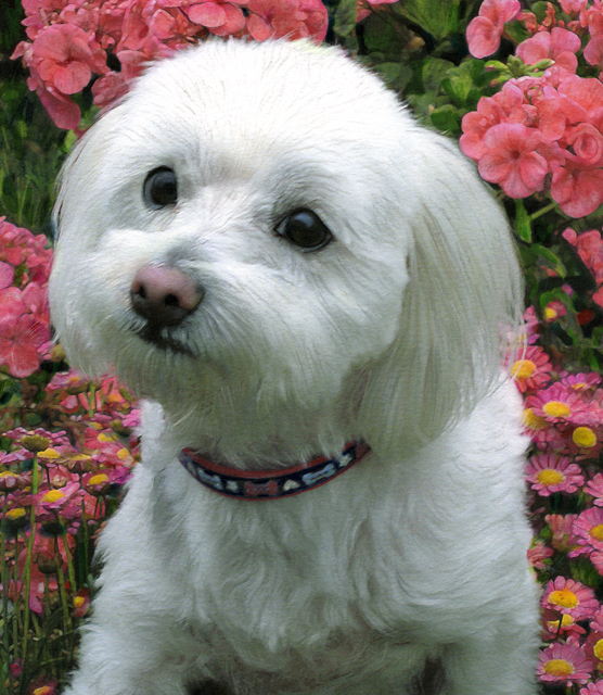
With this painting, I am sharing a pet portrait that I did for a good friend. It shows my versatility of adapting to utilizing the computer for my design and under-painting.


A close up

A second dog portrait that I did for my good friend.


Beautiful artwork! The first picture with the floral towels looks so real . . . amazing! I enjoyed seeing your great artwork. You are so diverse …and one of the most gifted and blessed friends I’ve ever met ….Love, Magda
LikeLike