
My strawberry illustration for Darigold yogurt.
From the beginning of my art career I specialized in still life imagery. Soon, I was illustrating a lot of fruit. Therefore, I not only considered my niche to be one of being a food illustrator, sometimes I’ve referred to myself as a fruit-label illustrator!
On this post, I will share a lot of images. There is less for me to write about in a technical sense, since I’ve already covered a lot of concepts that are applied to illustrating fruit. Water droplets certainly have enhanced many of my fruit illustrations.

This painting is purely transparent. The coolness of the grape “bloom” was through the use of purple.

To create a more photorealistic effect, I painted the dark creases between the segments.

The cantaloupe texture was definitely an interesting one to solve.


This is a more recent fruit illustration. The fruits were rendered separately and then digitally combined.

Creating digital images separately has many advantages. I even put shadows on the slice layers.

This illustration was an assignment for a vitamin supplement.

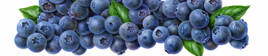
Blueberry choices. Droplets can always be added later on.

A blueberry close-up.
Here is a summary of things I’ve already discussed:
1. I always tend to incorporate reflected light, especially on spherical shapes.
2. I utilize complementary colors to enhance the more brilliant colors.
3. I utilize contrast to create depth and dimension. Highlights and shadows are important. Colors and shadows reflect between fruits if they are in a group.
4. I have solved many fruit textures using the “whatever works” method.
Regarding textures, here are a few tips of what I’ve done to solve some of my favorite, fruit textures.
a. Citrus peels are created using a transparent, acrylic glazing technique. See Post #12.
b. Dots that are light on an apple are either masked with liquid friskit, or applied with a toothpick and opaque white (Pen White or Acrylic), `or picked out with an exacto knife.
c. The texture on a pear can be created by spattering paint with a toothbrush.
d. The fuzz on a peach and the “bloom” on grapes are often enhanced through the use of light, colored pencils over the water based dye. The pencil can be “dissolved” by using a blender marker for additional effects.
Any time opaque white is added to dye colors; there is a bluish, “cool” quality that results. I have used that to my advantage in order to create the “fuzz” on a peach, or the cloudy, powdery coating on plums and grapes.

Painting these prunes was very fascinating – they are almost abstract when working closely.

A close up of those prunes.


Black currents are a strange fruit to render, but the leaf was fun.

This was a portfolio painting was done so I could advertise in an artist source book named “The Workbook.”


This is an example of how color pencil over watercolors can create a “peach fuzz” impression.

This was an illustration I did for Wegman’s juices.

Raspberry flavor Wegman’s juice.

Most of my raspberry paintings have stems attached.

It’s more interesting to paint raspberries with crowns, than holes.
Strawberries and raspberries have specific patterns to their “globules” and “hives.” Pineapples are challenging to illustrate and have a similar pattern. The spiky leaves on a pineapple are significantly purple and those leaves have a powdery coating similar to plums and grapes.

This pineapple illustration was painting as part of a Ready Pac Asian salad label.

Pineapple texture is interesting and incorporates a lot of complementary colors.

This is an illustration I did for a Pina Colada yogurt flavor. Coconuts have an interesting outside texture to render. It’s similar to a kiwi fruit.
 I have particularly enjoyed illustrating kiwi fruit. The hairy exterior, which is similar to coconut, is easily done using a crowquill pen and acrylic. I find the interior of a kiwi to be very beautiful, as I love the contrast of the iridescent, light green.

Lemons are one of the hardest fruits to illustrate. There is little opportunity for contrast, because it muddies up the color.

This orange juice label found another usage, when it was sold as a stock image.


I love the pink color on this grapefruit.

When illustrating citrus fruits that were cut open, I truly studied the patterns. I always attempted to maintain clean, segment separations and varied, “sparkling” highlights. Most of those highlights were masked out in order to keep them as white as possible.

Line drawing for my Wegman’s grapefruit juice label.

Line drawing for my Wegman’s orange juice label.

Final orange illustration.

Final grapefruit illustration.
When I created my stock library, I was able to create new compositions from many of my paintings. I have many “clipboards” or groups of fruit. It has been interesting for me to see some of my fruit illustrations that were purchased as stock and utilized in different ways.

A digital illustration that was created from different orange elements I had already painted.

An orange peel close up.

A banana clipboard that I used to create stock images.

My mango clipboard.

My purple grapes digital clipboard. I also have one for green grapes.

I have illustrated labels for several series of fruit flavored liqueurs.
 My specialty of being a “package design illustrator” involved many lines of labels for yogurt, juices and fruit flavored items.
I have so many illustrations of fruit to share, that I plan to do a separate post with many of my labels that were done for yogurt companies.
Over the course of my career, I think I preferred illustrating fruit to anything else, even vegetables! I am so comfortable illustrating any kind of fruit, that I can actually paint fruit without any reference at all!

This is a series of labels that were for the flavored soda water sold at Kmart, (which has since gone out of business.)

These were interesting to render because I was told I couldn’t use any complementary colors.

The invoice for my Sparkling Fruits project.


I have done a lot of illustrations for Wegman’s markets.


A series of vertical jam labels.


These labels I illustrated had to follow a very particular style. I didn’t like the strange droplet splashes they requested.

Guavas are quite beautiful. The texture for the outer peel here worked well for me. I enjoyed creating a waxy and bumpy effect.


One of the strangest fruits I’ve illustrated has to be passion fruit!

Keeping sharp highlights helps to make passion fruit interior have a jelly-like appearance.

This illustration was for a grape-seed vitamin supplement. Colored pencil is wonderful for achieving the powdering effect on grapes.


For stock purposes, I was able to utilize of of the fruit here separately. The cranberries are above.


This illustration was a version that was rejected and ended up being completely changed. I was paid for those changes.


This illustration was done for a juicy sour candy liqueur assignment. The extreme moisture was required.


 With the last illustration on this post below, I finally came up with something that allows for me to be a true illustrator. I created something that could not be photographed! YAY!


hi Judy,I must say say that u are an awsome designer.Amazing stuff.i too am a graphic designer however at a beginener level.If u dont mind cud i know what software u used for this cool stuff…
Cheers !!:-)
LikeLike
Dear Ali,
Even if you know of software “I used for this cool stuff” – please understand that when I illustrated most of these paintings it was before both computers and software were available. Most everything of mine is hand painted, and whenever I used computers to assist me, I have clearly described my technique while doing that. Maybe you need to check out more of my posts where I show my paintings in progress.
Thanks for your compliments, though!
Judy
LikeLike
Your work is beautiful and I like your focus on fruit/food. We do a lot of food packaging for our clients. Would you be interested in considering commissioned work of this style in the future?
LikeLike
Amazing work.
LikeLike
I would love one step-by-step tutorial!
LikeLike
Maybe I will do that someday, Bruno. But if you read my whole blog, there is a lot of information there!
LikeLike
Thank you…what a treasure your blog is.
LikeLike
Thank you so much for visiting my blog and for your kind comment, Rachel!
LikeLike
Wow I really admire your work Judy. Thanks for sharing. As a illustrator who does a lot of food illustration (digitally) seeing how work was done pre digital is fantastic.
Thanks also for sharing your cost estimates. I’ll have to show this to some of my clients who are not willing to pay much more now (17 years later).
LikeLiked by 1 person
Thanks for your comment, Phil. I forgot about sharing those prices. All these years later, I am working a lot and enjoying how I am able to use my older illustrations in a digital format. There was a shift with the digital age to getting 1/10 of what I used to get for artwork. But I can proudly say that now I am commanding the same prices as I used to get 17 years ago. I also get work because of sharing on this blog – it’s brought me up in the search engines. And that translates to not having an artist representative take 25% of my fee. Life is good, and comments like yours remind me why I love writing and sharing. Good luck with your illustrating!
LikeLike
I love your BEAUTIFUL fruit pictures!! They look good enough to eat! Have you published a book of your work? Or a set of illustrations to frame and put in my home. Do you sign your work? I did not see a name on the drawings. You captured the pineapple beautifully! I thought it was a photo! I did not see a last name Judy.
LikeLiked by 1 person
Your comment gave me a huge smile this morning, Cindy. Thank you so much!!!
Because most of my work is used on food labels, I do not sign things. I did do art prints of seashells early on in my career. This blog was something I created when I had some “down-time.” But my true passion is writing about my life and expressing myself through music. That blog is at http://www.myjourneysinsight.com. I’m actually busy illustrating again. I haven’t worked in watercolors in a long time and have gotten pretty reliant on using a computer.
I’m just so pleased to know that my blog can be appreciated by someone like you. Once again, you made my day. 🙂
Oh, and my last name is Unger.
LikeLike
Sou uma Artista Plastica,e amo os seus trabalhos tenho como inspiração, gratidão em compartilhar Deus te abençoe muito,e jamais desista dos teus sonhos!!
LikeLiked by 1 person
Thank you so much, Farides! I love your comment and you inspire me, too. I am living my dream as I create music that is healing for me and others. Thank you so much for writing. 🙂
LikeLike
amazinggg cool!
LikeLike
Thank you, Muflikhah!
LikeLike