When my illustration career slowed to a standstill, I blamed it on the digital age.
I did not easily embrace learning how to use the computer. But because I had time on my hands, I decided to submit my existing illustrations to stock agencies.
I purchased a decent Epson scanner and started scanning all of my watercolor paintings. I taught myself Photoshop and learned how to “stitch together” larger paintings scanned in two passes. Gradually I gained control of a stylus after erasing backgrounds and cleaning up dust spots on the hundreds of images I worked on.
With Photoshop, I was eventually able to manipulate my images in any way I desired. I’ve decided that I can call myself a “digital artist” because most of my process is done on a computer now.
My next step learning the digital process was when I created new compositions; I’ve named this “reconfiguring” and have written about it before. The challenge with “reconfiguring” was to separate a painting into layers. Any objects that were cropped and/or behind other elements had to be completed.
I looked for creative ways to fill in those blank areas. The Photoshop “clone” tool was especially useful.
It was definitely challenging to combine elements from different paintings in a natural way. I learned how to adjust light sources by moving highlight areas on a separate layer. Softening the edges of objects reduced the “cutout look.”
Shadows were very important and needed to be convincing and transparent. Over the years, I’ve improved my methods. At first, I digitally airbrushed any shadows. Now, I create a “duplicate” layer of any object with a cast shadow upon it and label that layer “shadow.” I darken it with the “levels” function in Photoshop and erase everything except for where I want the shadow to be. That way, the original layer is undisturbed.
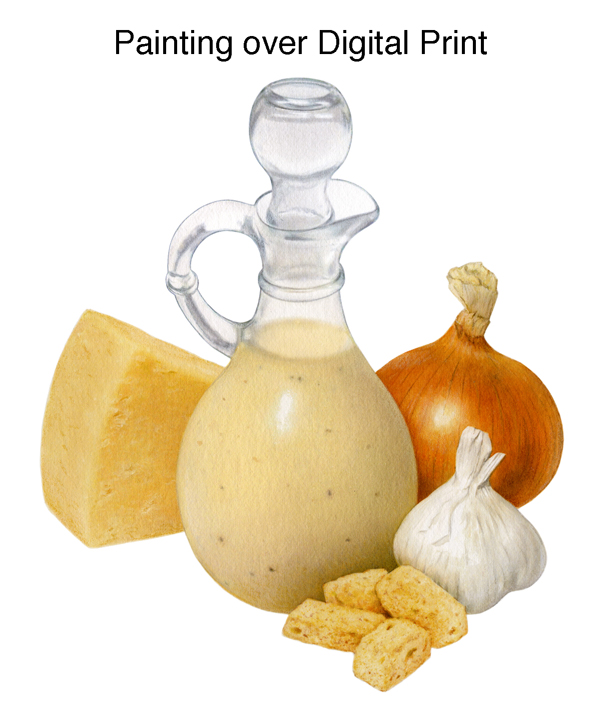
Sometimes, I also “excised” a single image from medleys so I would have that specific image available. I share below a salsa label that was painted “traditionally” with watercolors.
Learning how to “reconfigure” led the way to creating photo-comps for all of my assignments moving forward. Clients seemed to really appreciate seeing layouts that were very close to my final version. This was such a change from the way I had worked in the past. I didn’t have to create marker renderings over my line drawings to indicate colors anymore.
The best part was that I could quickly email those photo-comps and make changes over and over until my client was satisfied.
It has been four years since I’ve shared technical information on this blog. Shortly before I went on “hiatus,” I still painted with watercolors over a print based upon my photo-comp. Currently, my process is similar except that now I use colored pencils instead.
My printer is an Epson EcoTank Photo ET-8500.
When my photo-comp was approved, the next step was to print the image onto high quality matte paper. This became my “road map” that I would look at as I painted.
My painting began as a light print that would become an “under painting” for my final illustration. I didn’t I have to painstakingly trace and transfer a line drawing to watercolor paper anymore!
I prepared ahead of time the watercolor paper to use in my printer. I carefully cut large 22 x 30 sheets of 140 lb. hot-press watercolor paper into perfectly measured 8½ x 11 sheets that would fit into my printer. If they were not exactly sized right, they would get jammed.
Because I usually illustrate for packaging and my paintings are small, I seldom have worked larger than 8½ x11.
I experimented to print my image in a way that worked for me. Areas had to be very light so I could add details and work them darker. If colors were way off, it was a lot of work to adjust them with transparent watercolors. It wasn’t unusual for me to make twenty prints before I was satisfied.
It was great that the Epson inks were waterproof and did not react to my watercolors by bleeding. However, I still used frisket as a mask to keep the edges sharp and clean.
Once I had a print that was satisfactory, I lightly rubbed on the back with a damp sponge. I stapled it to a board and let it dry. Now it was stretched and ready!
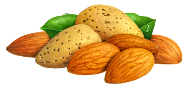
With this technique, my illustration was more than 50% finished. It was an amazing timesaver and the best part was that if I needed to start over – I just made another print. I also didn’t worry about having a painting that was 100% complete. If I wanted a better leaf, I rendered it on another print and “pasted” it over digitally onto my final scan.
At this time, I submit a photo-comp and after approval I refine it far more than in the past. I can spend a lot of hours working on my computer; I often have to remind myself that once I print my image – those details will lessen.
Occasionally, I will print out a far more detailed and saturated image onto excellent quality textured paper. I work over my print with Prismacolor pencils and occasionally add light touches of acrylic.
Unlike the watercolor process, my pencil work doesn’t affect tones or color very much. My goal is to add texture, eliminate detail and make the illustration less photographic overall.
I know I’m repeating myself, but there is complete irony that I began my career making paintings that resembled photos, and now I was trying to make photos look like paintings!
One of my first “digital print” projects where I switched over to colored pencil instead of watercolors was for an illustration of chipotle peppers.
The illustration was to be used on a pizza box and I had to create new art. Rarely is that required of me, since I have such an extensive library of existing food images. But now I am intimately acquainted with chipotle peppers. They were a lot harder to illustrate than I thought.
It was because they were incredibly ugly and no actual reference existed!
Every job of mine begins with finding reference. I contacted the art director after going to a local Latino market looking for an example of chipotle peppers. I told her that I couldn’t find any actual peppers to work from. It seemed that they only existed as a picture on a can. And inside the can, those peppers were soaked in Adobo sauce. I needed something better than that to work from.
So she emailed me a picture that I will name “Pepper Corpses.”
I couldn’t believe it – how in world would I illustrate peppers looking like that?
It was time for me to be truly creative. I remembered seeing dried peppers at a Hispanic market. I would just go back and find something “similar.” I must mention that I was also searching for reference on another assignment. I needed items of caramel, chocolate and ice cream. For a few weeks I became a supermarket sleuth! My dining room table was covered with illustration reference.
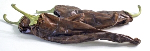
Unfortunately, the peppers I found did not really match the shape or color. Some were very tiny, long and a bright red color. Others were longer, wider and brown in color. I altered my photos and tried to match the photo of pepper corpses above. I then shot them off to the Art Director, whom I will call AD.
AD sent me back more photo reference.
Aha! Now I was on the right track! Once again, I went back to the Hispanic market and went through all the bins of dried peppers while holding a color copy of those images above. The penny was helpful for size, but there was still nothing that matched. But I knew with Photoshop I could do wonders.
As I was walking toward the checkout line, there was another bin. Wallah! There were peppers that really seemed close to what AD wanted. Hint: They were not Chipotle.
I began my digital work and delicately erased the background and arranged the peppers into different compositions. I sent my layout choices off to the AD.
The AD picked B. But now, the color had changed. Brown or eggplant color was out and I was instructed to create something with a deep red. I created another layout on my computer.
My layout was approved! I felt like I saw peppers in my sleep by now. My eyes burned because I rubbed them by mistake while I was photographing the dried peppers. I forgot how potent those peppers were!
I printed out my image. Then I worked over it extensively with colored pencil, especially to soften the highlight areas that were numerous and busy. I used a colorless blender pencil and touches of acrylic for extra details.
I sprayed my artwork with a matte fixative when I was finished to smooth out the shiny areas.
Even with my clear photo-comp, clients can see things later on that they want changed. So revisions to final art still happen – and often. I sent off the final art and waited for a message telling me my artwork was approved and that I could send an invoice. I held my breath.
The AD sent me a message with a tiny revision. It wasn’t difficult with my computer to alter the artwork. But of course, I thought, “Why didn’t she see that sooner?”
I made the small change and then I received her message below:
Judy! Client loves the work and is so thankful we talked them into illustration vs. photography. All approved!! : )
THANK YOU SO MUCH again for jumping on this! Shoot over your invoice and I’ll get it into accounting right away. Yippeee!
I wrote back:
Wow! You just made my day. 🙂 🙂 🙂
After illustrating peppers, I feel like I’m hot stuff.
Judy


This is absolutely fascinating!
LikeLike